History
In 1919, Oswald "Oz" Cooper set out to make an extra bold Roman typeface, drawing inspiration from his earlier work Cooper Old Style. Cooper Black was officially released in 1922 by Barnhart Brothers & Spindler Type Founders. Cooper Black was immediately popular in advertising and newspaper headlines.
The typeface's distinctiveness lies in its bold and soft-edged design with prominently featured serifs (the curved bit on the edge of the font) made Cooper Black a versatile and friendly typeface. Unlike other flat-bottomed fonts at the time, Cooper Black had curved bottom edges which made it very forgiving to irregularities. This meant it didn't need to be laid in a perfect straight line to look "right". This suited the printing format of the early twentieth century, as using wood and metal type led to many printing errors. Another remarkable feature of Cooper Black is the tilt of the letters "o" and "q", with the slightly tilted vertical stress leading to a unique aesthetic which combines well with the other letters.
Thanks to its success, Cooper Black spawned many copycats, which led Oswald Cooper to attempt to patent the typeface in 1930, but he faced legal obstacles as it was deemed to resemble a pre-existing logo.
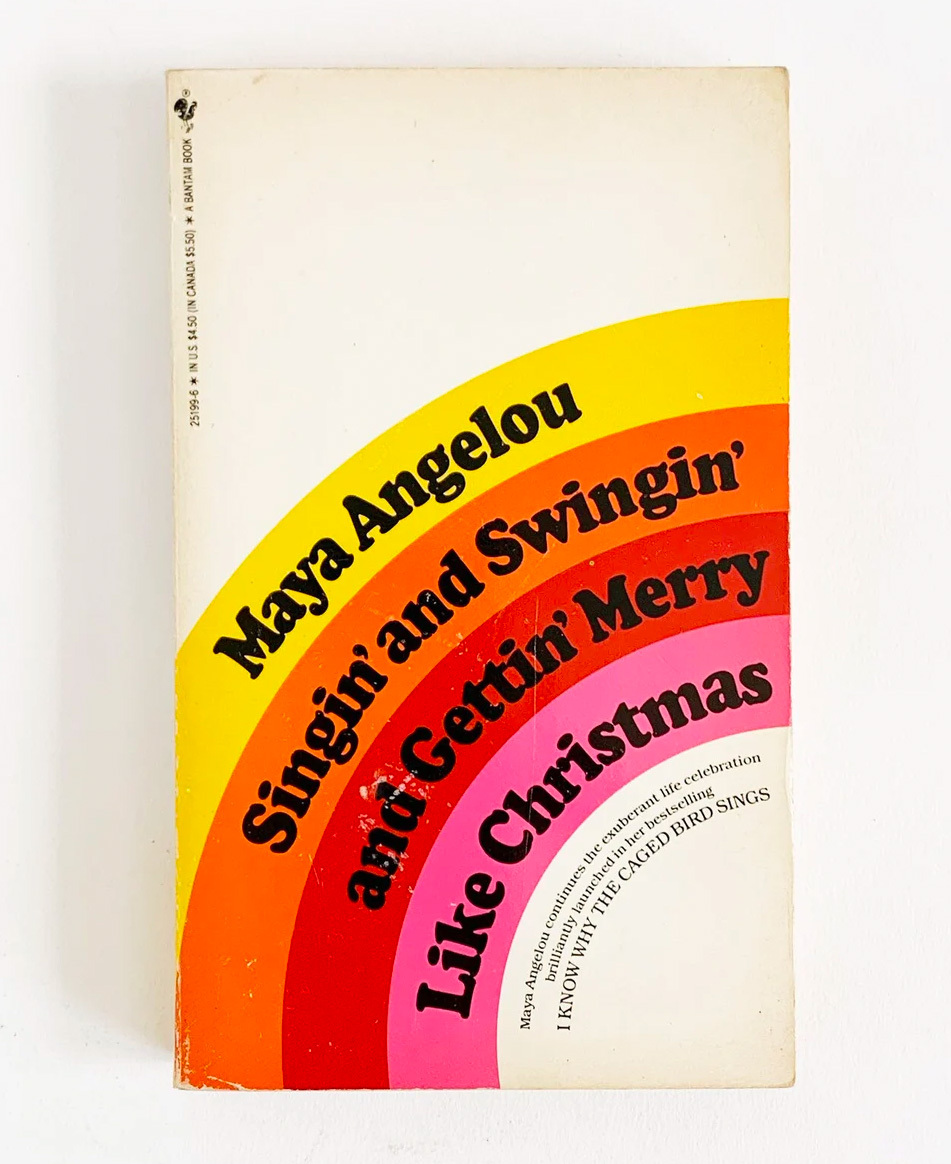
After Oswald's death in 1940, the typeface fell into relative obscurity before witnessing a resurgence in the 1960s and 70s due to new forms of printing - phototype and letraset - which made it easier to squish the letters together. In this new environment, Cooper Black flourished, becoming popular in adverts, albums covers and film posters.
While Oswald could never have prediced its renewed success - he often remarked that it looked best when kerned and leaded tight - in other words, not much space between each of the letters and each of the lines. This was very difficult to do with the old forms of printing (woodtype and metaltype) and much easier in letraset and phototype.
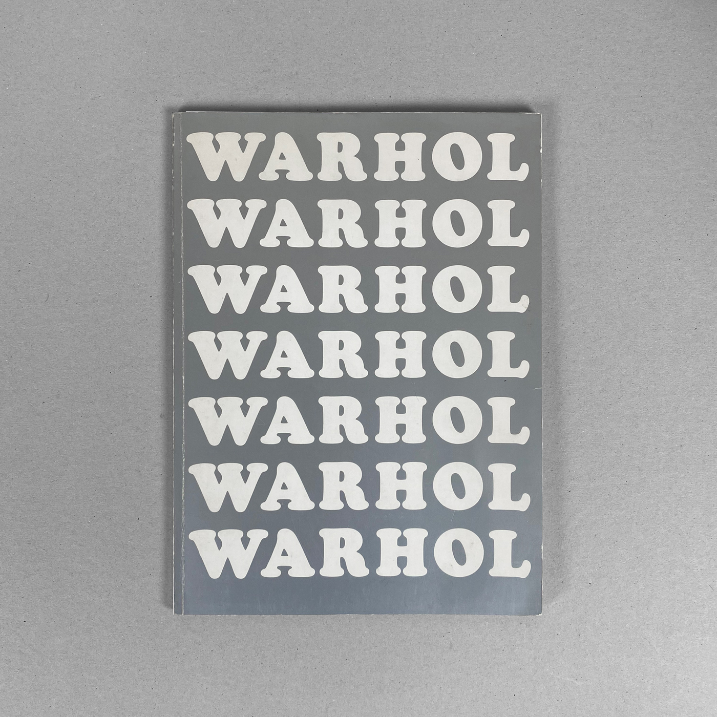
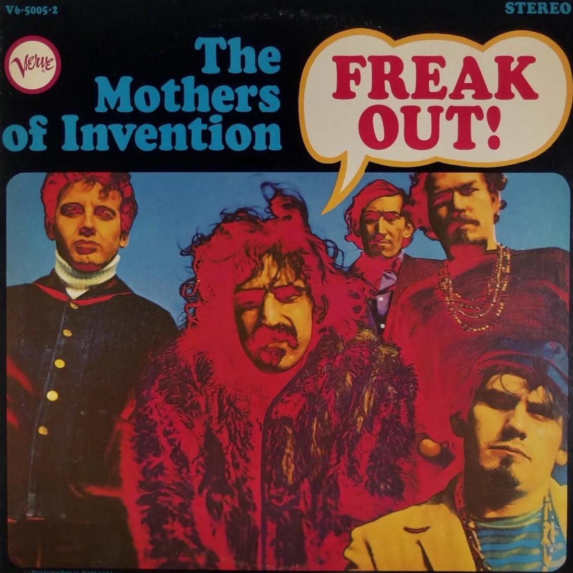
Cooper Black's ready availability in Letraset also allowed it to be embraced by DIY graphic designers, who used it for anti-war protest posters, underground magazines, and other countercultural expressions.
In Use
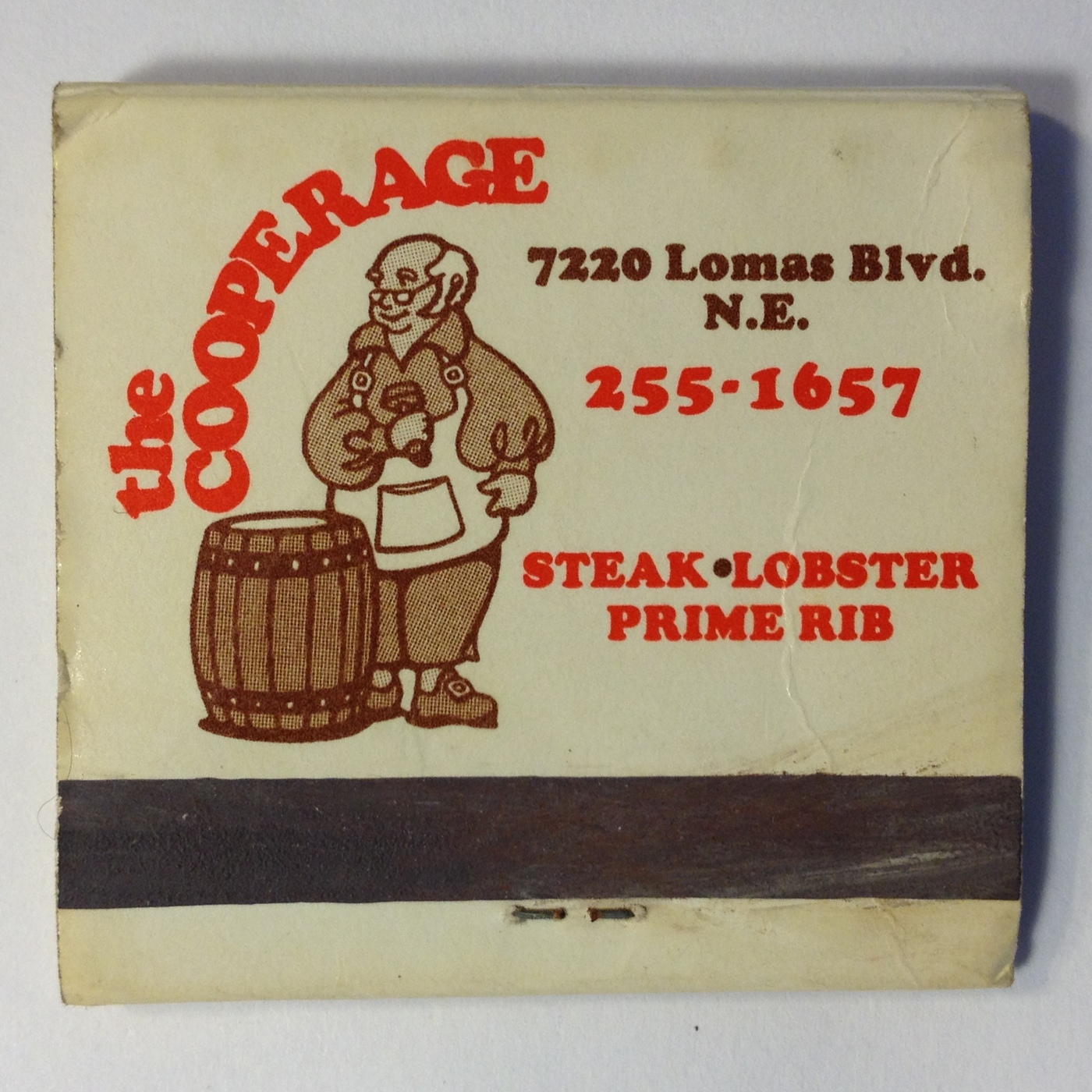
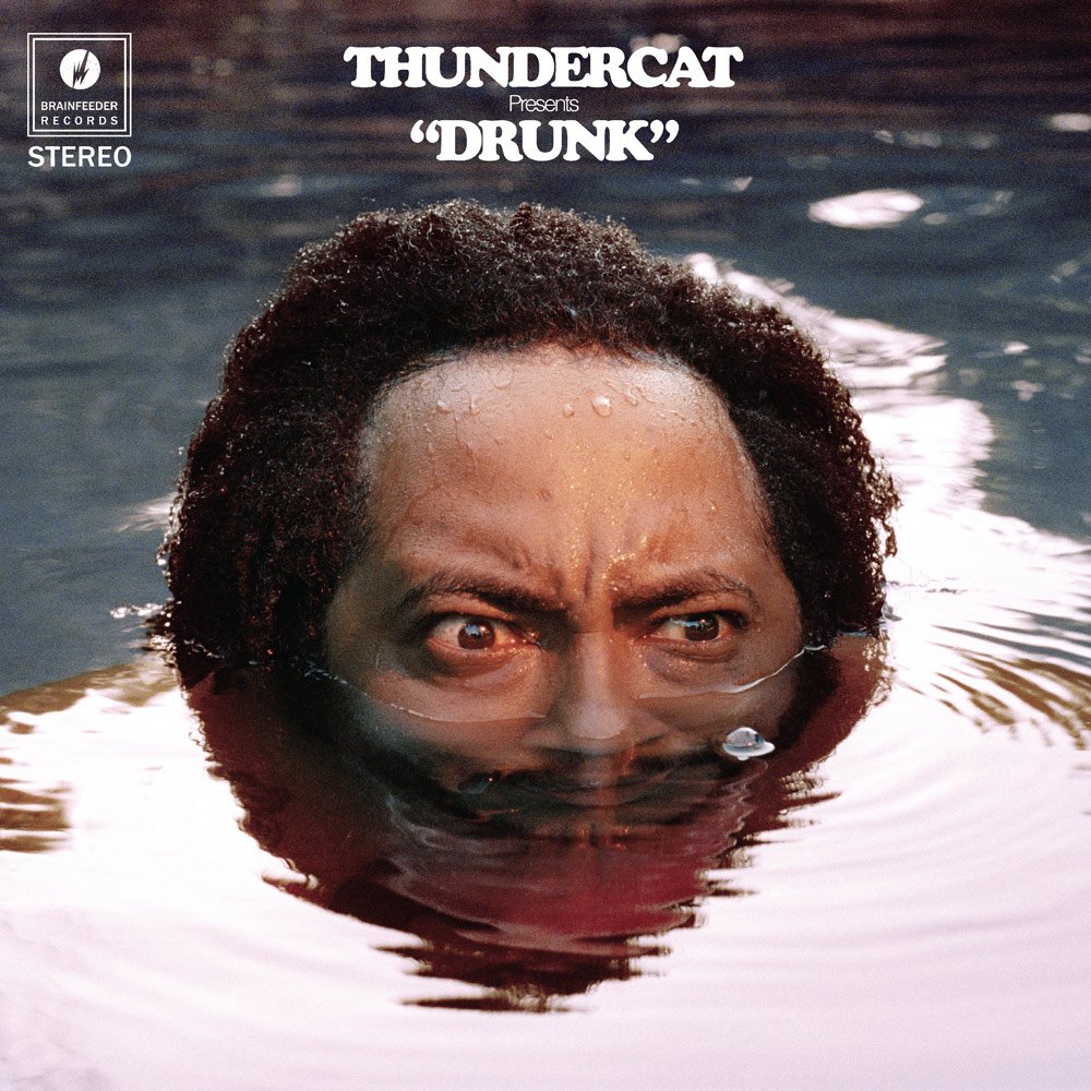
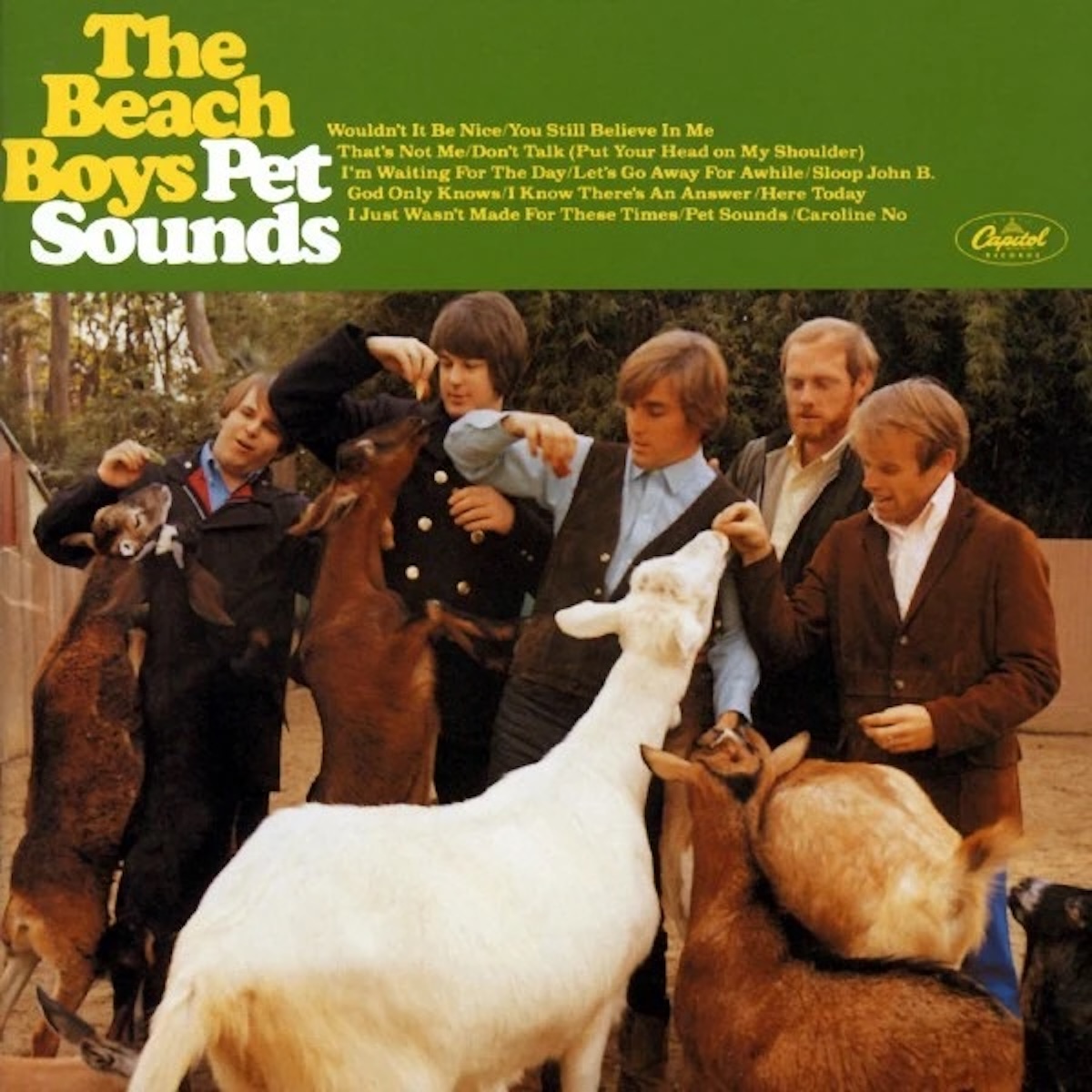
In 1966, its use in the title font of The Beach Boys' iconic album "Pet Sounds" catapulted Cooper Black into the cultural spotlight. It continued to gain traction, becoming the go-to font for novelty T-shirt designers and retaining its popularity among business owners who appreciate its friendly and familiar qualities for their signage.
In 1995, the UK budget airline easyJet chose Cooper Black for its branding, ensuring that this typeface continues to leave its mark on design history, even decades after its release.
You can see more examples of Cooper Black in use here:
Guide
Lorem ipsum dolor sit amet consectetur adipisicing elit. Et, cumque nam deserunt dicta natus quibusdam hic dolorem minima quis? Doloremque amet inventore libero! Hic magnam ut eaque cupiditate exercitationem porro?


Game
Lorem ipsum dolor sit amet consectetur adipisicing elit. Hic, ut nihil doloribus voluptates sapiente qui incidunt quidem. Laudantium repellendus, nobis, dicta commodi excepturi ut beatae quisquam nemo architecto labore mollitia!
Resources
Lorem ipsum dolor sit amet consectetur adipisicing elit. Minus modi qui nisi possimus facilis officiis laboriosam at aliquid soluta! Sapiente tenetur voluptas magni nostrum incidunt mollitia vel nihil iure necessitatibus!